
Health & Medicine
The maths and ethics of minimising COVID-19 deaths
Mathematical and epidemiological modelling helps us understand whether Australia is flattening the COVID-19 curve and allows us to work backwards from a manageable health services demand – keeping it ‘just flat enough’
Published 28 March 2020
The Australian government has brought in a range of measures that aim to slow rather than completely halt COVID-19.
The strategy, now familiar to many Australians, is known as flattening the curve and it attempts to spread the number of people infected by the virus out over time so the country’s health system isn’t overwhelmed.
This is particularly true for intensive care unit (ICU) hospital beds for those people who become severely ill.
So, according to mathematical modelling how will we know when it is working? And how do we know how much harder (or not) our physical distancing policies need to be to keep the curve ‘just flat enough’?
To understand this, we need to break down the numbers and address a few key questions.

Health & Medicine
The maths and ethics of minimising COVID-19 deaths
We can answer this question in two steps.
It takes about seven days on average from the time we start increasing physical distancing before we can see a change in the daily rate of symptomatic cases.
But we need an extra buffer, adding on around one or two days for symptomatic people to realise they are sick, see a health professional, get tested and get their result.
Then there’s also the lag time between being diagnosed and actually needing critical care.
If a person is one of the unlucky ones who becomes severely ill with COVID-19, that adds approximately five days between becoming symptomatic and (if needed) hospitalisation, then another six days until (if needed) admission to ICU.
It’s important to note though that these numbers will be refined in the next few weeks as more data comes becomes available – all part of the rapidly moving and uncertain world we live in at the moment.

Health & Medicine
How to take care of yourself if you have COVID-19
So we’re looking at around 10 days from bringing in stricter social distancing measures until we see a change in reported case numbers, and another 11 days (call it three weeks in total after social distancing changes) until we see a change in ICU admission rates.
It’s not easy.
Think of our current measures against COVID-19 like being at the back of an oil tanker and steering it with the rudder of your two-person dinghy. It takes patience for the bow of the oil tanker (in our case, the daily numbers of COVID-19 infections) to slowly turn.
Additionally, until we have a bit of experience, we don’t really know how much the oil tanker will turn (with a lag) as a result of a nudge versus a panicked throwing of the rudder.
This is the extraordinarily challenging task of our politicians, chief medical officers and scientists.
So here in Australia, it means we have another week to wait before we see how much COVID-19 will be slowed by the ‘tightening’ of physical and social distancing measures brought in between 21st to 24th March.

Health & Medicine
Protecting our ageing population from COVID-19
But rather than drumming our fingers on our desks waiting, we need to establish how we are going to know if we are on target when all of this useful data starts coming in.
That is, what is the counterfactual – or what would have happened in the absence of these measures – had no tightening occurred from 21st to 24th March?
The first graph (Figure 1) gets us up and moving.
Here, in Figure 1, we have plotted four scenarios – each twice.
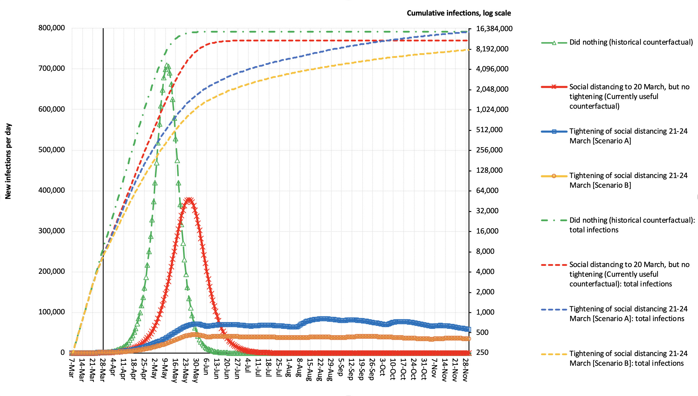
If we start with the green lines – this is a counterfactual of historic interest now, where we assume we hadn’t responded to the COVID-19 epidemic at all, and just ‘let it rip’.
To do this, we worked on the basis that in the early stages of the epidemic, the number of new cases was doubling every four days – a slightly messy concept as the (vast) majority of early cases were international arrivals.
But with our borders now shut, the epidemic will more closely obey the principles of exponential growth. That is 1.189 to the power of four [days] which is two – a doubling.
So, we assume the number of cases increases by 18.9 per cent every day in this ‘natural’ state.

Sciences & Technology
Modelling the spread of COVID-19
But this percentage daily increase will reduce over time as more and more people get infected and become immune – a limit which we set up mathematically in the model.
So based on those workings, the peak number of infections per day is more than 700,000. But note that many people don’t become symptomatic when infected – about half in our model – but it varies enormously by age and is an area that we need better data on.
Back to 700,000 infected cases a day (about 350,000 symptomatic cases) – this is an absolutely disastrous scenario that Australia is not allowing to happen.
Also plotted in green is the cumulative number of infections on the log scale. Here, each unit increase on the y-axis (the vertical) is a constant multiplicative increase. So the scale might go 2, 4, 8, 16 and on from there.
Most of you will have seen graphs like this before. It essentially goes up linearly (due to underlying exponential growth), but flattens out when the number of people in the population who are immune (due to infection – or vaccination) becomes sizeable.
That was the warm-up.
The red lines allow for the fact that we did do some distancing in Australia before the more dramatic policies of 21st to 24th March.

Health & Medicine
COVID-19 can reframe health politics
Here, we reduce the daily ratio increase in numbers from 1.189 to 1.101, which equates to a shift in the reproduction number (R₀) of 2.5 to 1.8, a nearly 50 per cent reduction in the ‘excess R₀’ (i.e. R₀ – 1).
Nobody knows exactly how much these early attempts flattened the epidemic curve, and correspondingly bent the log curve – but let’s work with this for now. We expect this information will be updated in the next few weeks.
Based on these numbers, the peak number of infections per day is pushed back until late-May and is lesser in magnitude, but still not pleasant.
In the blue lines, we assume that the ratio increase in the cumulative number of cases each day (among the susceptible) is reduced by about 70 per cent in late March (that is, down to a 1.06 ratio multiplier each day; equivalent to R₀ from 2.5 to 1.45).
And then clamped down further to a ratio multiplier or 1.01 (equivalent to R₀ falling to 1.1 from 2.5).

This is a common feature we observe – to flatten the curve in a way that makes it manageable to both our society and health services, there needs to be another phase of further tightening (if not lock down) in April.
Then, depending on the scenario and updates as we get better data, an easing off of social distancing could commence in June. Yes, this is going to be a long haul.
These reductions are relaxed over time to society moving around normally again from November-ish.
Looking at the orange curve, the percentage reduction in daily increases in the total number of cases is over 90 per cent (equivalent to R₀ ≈ 1.1), then eases off to society moving around normally again from next year.

Health & Medicine
What is COVID-19 doing to our mental health?
We did mention this was a long haul.
It’s important to state again, we don’t know exactly how the distancing measures imposed from 21st to 24th March will play out – but fortunately, this is not (yet) mission-critical.
The trick is to crosswalk these blue and orange lines to work out the likely number of ICU admissions.
So, if we now look at Figure 2, we drop the ‘of historical interest only’ counterfactual of just letting the epidemic play out, but retain our current counterfactual (the red line), as well as scenarios A (blue line) and B (the orange line).
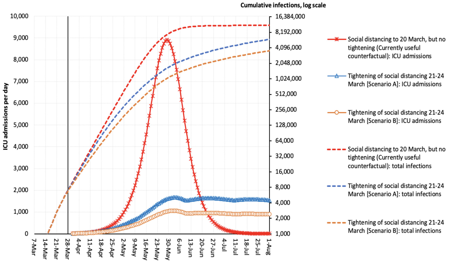
Our secondary y-axis (the right-hand vertical) is unchanged – our log increases in total number of infections per day.
The difference now is what is plotted on the y-axis on the left – the number of ICU admissions per day.
Under our counterfactual of moderate social distancing up to 20th March (but no tightening last weekend), this could mean a peak of 9000 warranted ICU admissions per day – way too many for us to cope.

Sciences & Technology
Keeping aged care residents connected
Scenario A (blue line) lowers the peak to just over 1500 warranted admission per day, and the Scenario B (orange line) to about 1000 a day; this is manageable if we double current capacity, working on the 2400 ICU beds currently available in Australia and an average ICU stay of five days.
However, if the average ICU stay is longer than five days, we are in trouble.
There is some good news though.
All of the above graphs simply assume the same percentage infection by age. If we can really protect our over 60 year olds (and those with chronic conditions), so they have a lesser, say a 20 per cent risk of infection, the number of ICU admission is approximately halved.
But the quid pro quo is that those fit and healthy under 60’s need to have a higher, say 70 per cent, infection rate in order to get to 60 per cent of the population infected to achieve herd immunity.
If a vaccine arrives before then, that will finish increasing our herd immunity rather than through infection.
Are the above curves we’ve mapped out 100 per cent correct? Almost certainly not.
But are they useful? Absolutely, yes. They give us a starting point.
Now, we start watching the incoming data very closely, we update it each day and see how we are tracking.

By next weekend, around the 4th or 5th of April, we should have enough data for us to see how Australia is tracking, we can update the infection number curves and see what that means for ICU admissions.
Our graphs suggest we are some weeks away from peak ICU demand, and crucially that means we have some time left to prepare and work out how to use our dinghy rudder on this COVID-oil tanker epidemic.
Not much time, but some time.
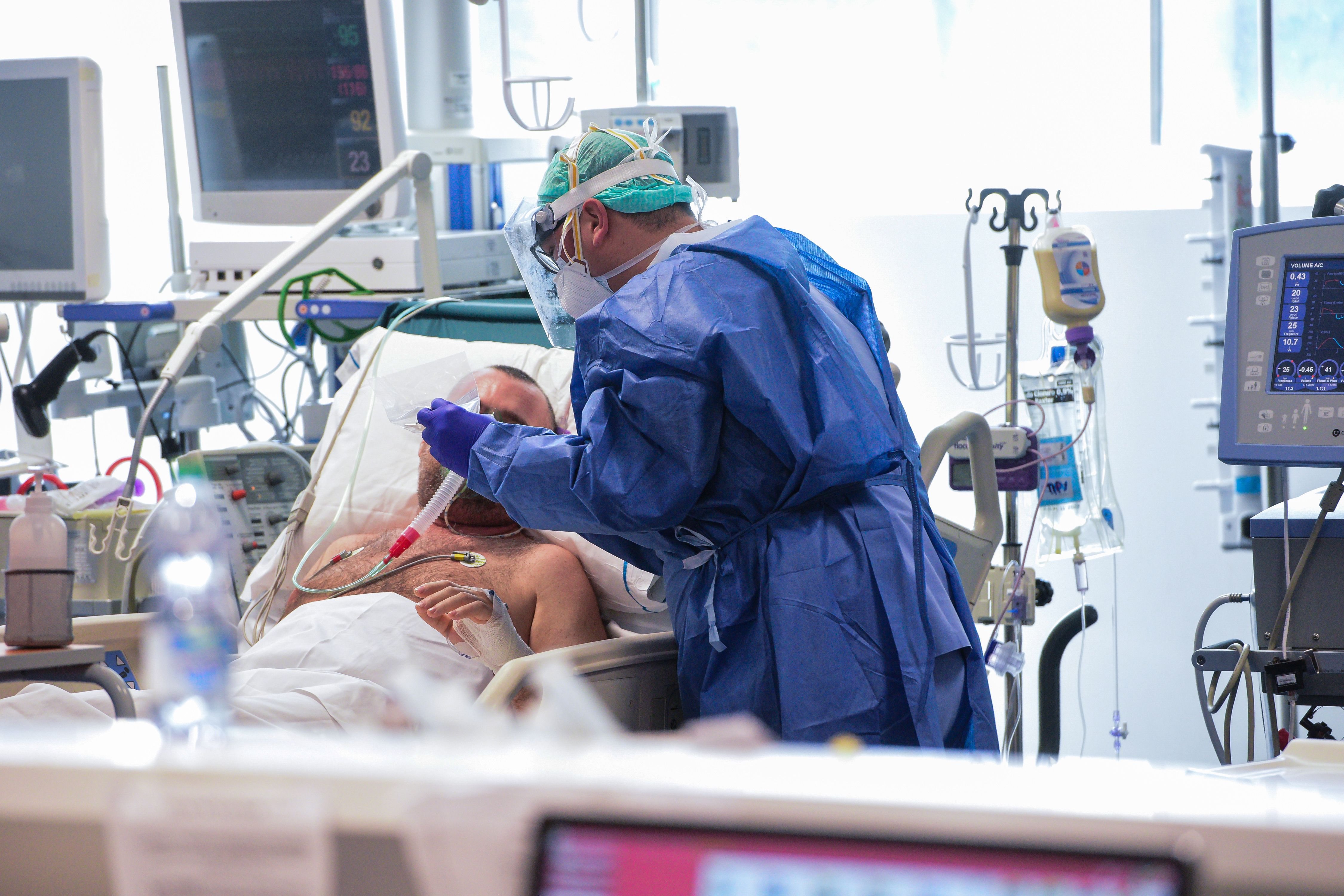
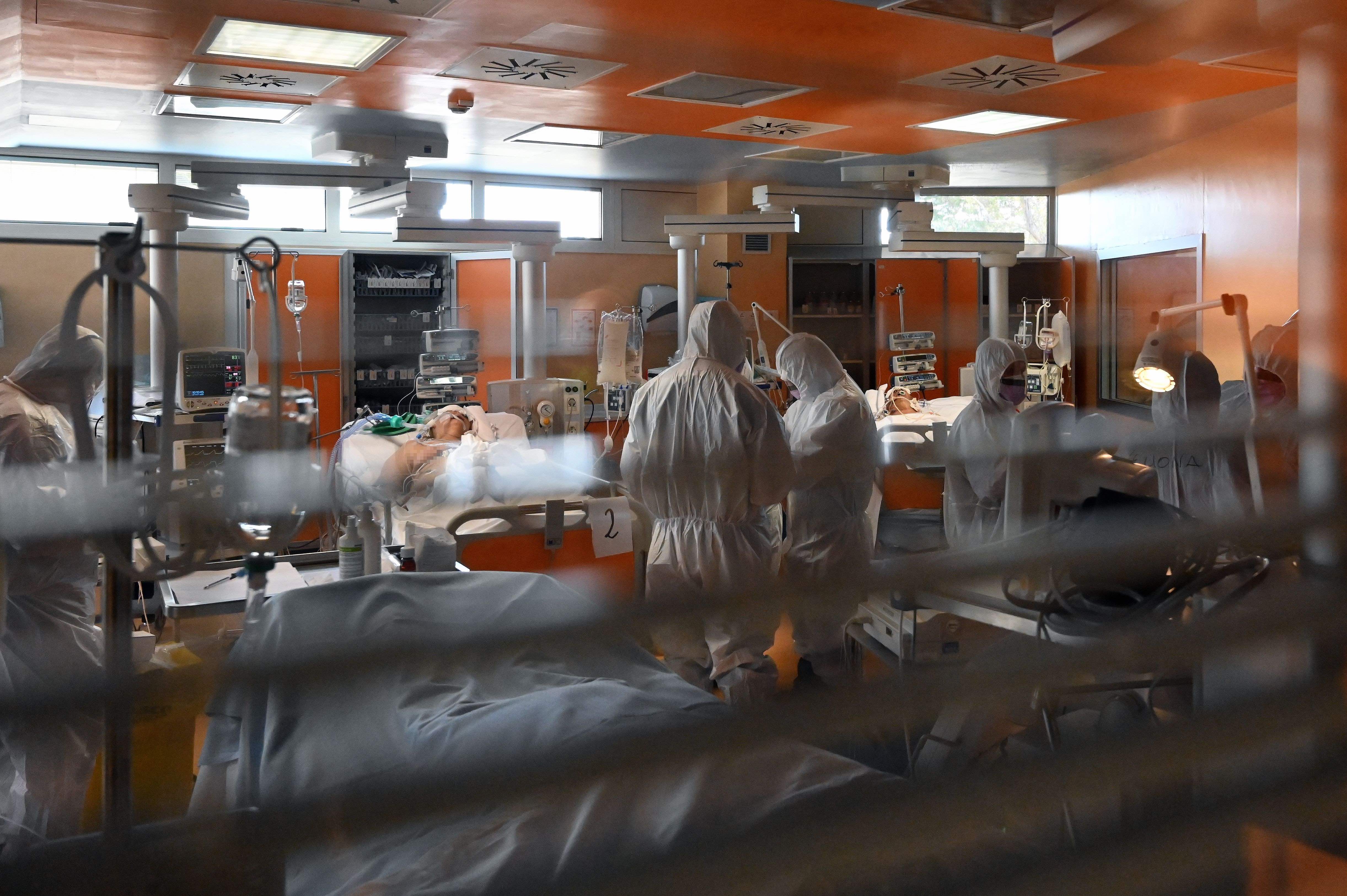
Banner: Intensive care unit in the Brescia Poliambulanza hospital, Italy/Getty Images