What’s the right COVID-19 risk to live with?

As Australia looks toward opening its international borders, new virus modelling provides scenarios that can help us decide what’s the right risk to tolerate
Published 8 July 2021
As Australia inches up its vaccine rollout, the question of when the country can open up has become more pressing.
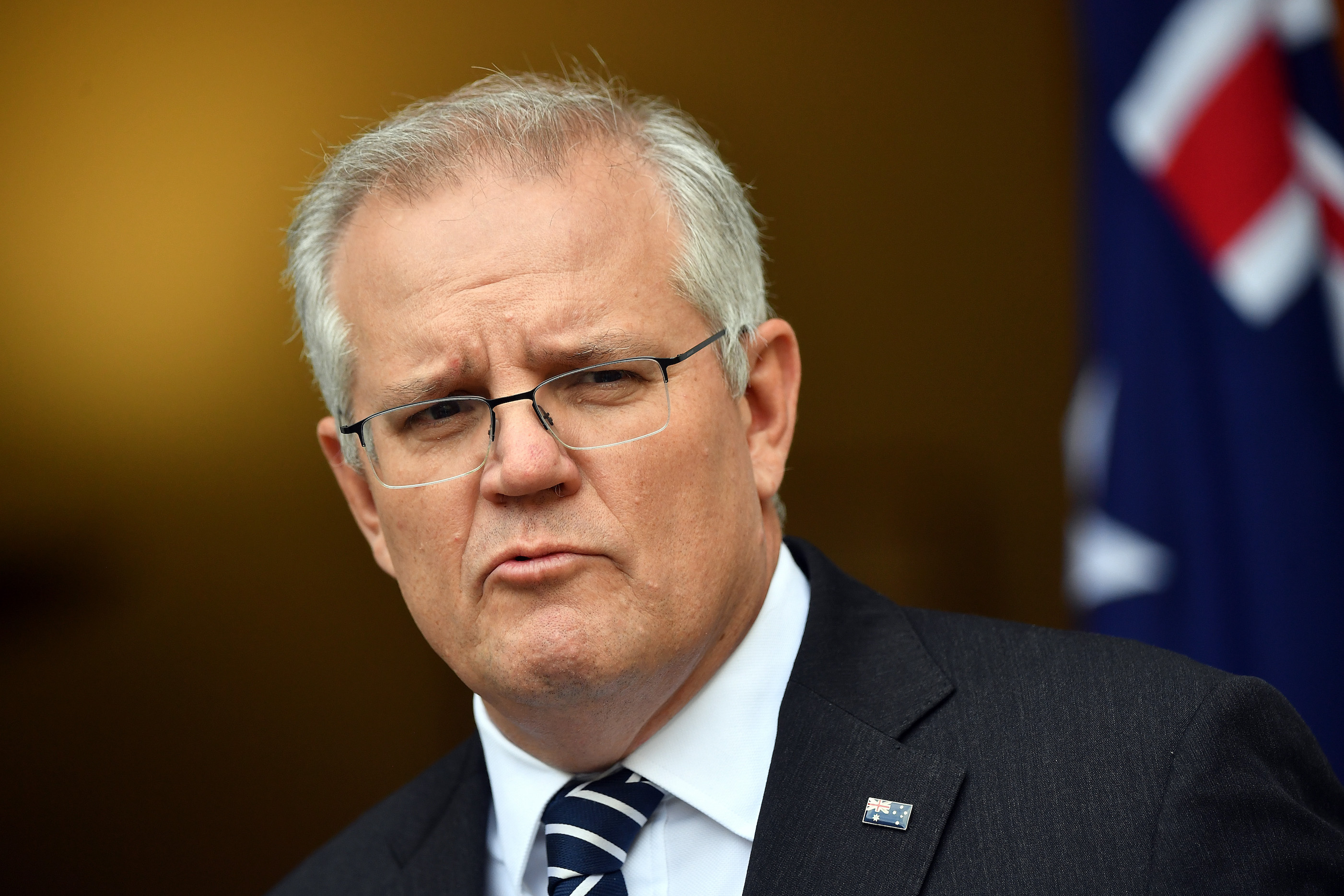
Last week, Prime Minister Scott Morrison announced the Federal Government’s four-phase plan. Phase 1 involves vaccinating, preparing and piloting opening up, before moving onto Phase 2’s post-vaccination plans, through Phase 3 and onto Phase 4 when life becomes relatively normal.

It’s the transition to Phase 2 that’s critical – as it’s supposedly underpinned by a vaccination coverage threshold which means Australia can open up its borders to international arrivals without quarantine.
But, with respect, this is the wrong way to look at it.
Vaccination coverage is very important, but so too are a number of other factors; the expected number of infected people arriving per day, the pre-departure requirements of vaccination and polymerase chain reaction (PCR) testing of travellers to Australia, the policy responses we have (do we continue to aggressively suppress the virus, or do we allow high numbers of infections before we use lockdowns?), and the reproductive rate (known as the R0) or infectiousness of the virus.

During Victoria’s second wave of COVID-19 in 2020, our team created an agent-based model which calculated the probability of eliminating COVID-19 from the state, as well as the optimal strategy in terms of health and cost impacts.
We have now updated this modelling for 240 different scenarios, 100 times each, to look at a two-year period: the year leading up to our borders opening as vaccination coverage increases and the year after borders open.
We use Victoria as the case study, but the results are applicable to Australia’s other States and Territories, the whole nation and even other countries working out when they can open up.
If we focus on the year after Australia opens up, the scenarios we use are combinations of:
1) Our achieved vaccine coverage (which ranges from 50 to 90 per cent) for people aged over 16, or for both children and adults.
2) The reproductive rate of the virus in the pre-COVID-19 world with no restrictions of 5.0 and 6.0.
3) The policy settings we use for outbreaks and growing infections: a) Tight suppression, where more than 10 to 20 per million cases escalates to a Stage 3 (soft lockdown) or Stage 4 (hard lockdown) (similar to South Korea in 2020). b) Loose suppression, where more than 50 to 100 per million cases escalates to a Stage 3 or Stage 4 lockdown (similar to Europe in 2020). c) Barely suppression, where more than 500 to 2000 per million cases escalates to a Stage 3 or Stage 4 lockdown.
4) And the number of expected vaccinated but infected arrivals per day into Victoria: 0.2, one, five and 25.

And it’s this last figure of expected arrivals that’s critical.
While 0.2 vaccinated but infected arrivals per day sounds low, it’s achievable – equating to 4250 people a day (half pre-COVID volume) coming from origin countries with a low infection rate (five per day per 100,000) – like Vietnam in early July 2021.
And five vaccinated but infected arrivals per day is the same number of arrivals coming from countries with an infection rate of that currently in Mexico.

Health & Medicine
The global race to understand COVID-19 variants
You can estimate the vaccinated but infected arrivals for different scenarios with our online calculator and use it yourself to interpret our results.
Finding our tolerable risk
Our team have created ‘heat maps’ of average daily infection rates in Victoria in the year after borders open up for all 240 scenarios.
Green is good, and red is, well, bad. You can interact and explore all of these scenarios online on our COVID-19 Pandemic Tradeoffs tool.
In the graph below, average daily infections range massively.
We can start from 0.6 (if there’s 90 per cent vaccination coverage for everyone over five years old, an R0 of 5.0, minimal expected vaccinated infected arrivals per day of 0.2, and a tight suppression policy setting to keep outbreaks in check), and end up at 1136 per day for the worst-case scenario (if we have 50 per cent vaccination of adults only, an R0 of 6.0, 25 expected infected arrivals per day and extra loose suppression that only uses lockdowns at very high infection levels).

But in order to make an informed decision on what our tolerable risk might be, we also need to think about the non-health consequences. And for this, we look at the proportion of time spent in lockdown, shown in Figure 2.
The pattern of lockdowns is not a simple increase from the top left corner to the bottom right.
Why? Because tight suppression trips into lockdowns at relatively low infection numbers – too low, we contend, for a world where we are trying to live with the virus once enough of us are vaccinated.

We doubt the Australian public would tolerate more than 10 per cent of their time in lockdown (that’s four weeks each year), so this rules out large swathes of options that are yellow to red in Figure 2.
But what is the right amount of risk to tolerate?
That’s a question for society and for discussion in the next few months. But to help that discussion, Figure 3 shows a ‘joint heat map’ where we colour from green to red all cells based on both infections per day and lockdowns.

Narrowing the options
The decision as to what risk to tolerate is not ‘a scientific number’ for two reasons.
You cannot look at vaccination coverage alone, but rather determine the risk we are prepared to live with and find the settings that keep within that risk. On top of this, the tolerable risk is a societal and political decision.

Health & Medicine
Getting a COVID jab is safer than taking aspirin
But we can whittle down our scope to inform that decision.
Firstly, it’s unlikely we will achieve 90 per cent vaccination coverage – so, let’s remove that.
Secondly, conversely, it’s not ethical to open the borders until all adults (and arguably all children) have had the opportunity to be vaccinated. It’s likely that once everyone has had that opportunity, vaccination coverage will be at least 60 per cent – so, we can remove the 50 per cent option.
Thirdly, tight suppression is probably not fit-for-purpose once borders open – everyone is over going into lockdowns.
Fourthly, the Delta variant (and any new variants) will likely have an R0 of greater than 5.0 – so we can delete 5.0.
Fifthly, the Australian public is unlikely to accept the high and unacceptable risk options – so we have blacked them out.

And finally, given that the risks of getting COVID-19, even for children, likely exceeds any risk of vaccination, we cannot ‘open the borders’ until children have at least had the opportunity to be vaccinated.
So, now we are left with only 15 scenarios, and a more manageable heatmap to help make those decisions.
So, what do we recommend?

If we achieve 60 per cent vaccination coverage, we can open up to countries and a number of arrivals that keeps the expected number of vaccinated but infected arrivals to one or fewer per day – which is not too onerous. As above, this is equivalent to half pre-COVID arrivals from countries with similar infection rates to Vietnam at the moment.
If we reach 70 per cent vaccination coverage, we can perhaps relax the borders a bit more to – say – a total number of arrivals from countries that generate between one to five infected arrivals per day.

Health & Medicine
Should we pay Australians to get vaccinated?
If we do really well and get to 80 per cent coverage, we can relax further to a volume and risk profile of arrivals that generates 5 infected arrivals per day.
Could Australia also look at some incremental border modifications before the ‘fuller’ opening in early 2022?
In our view, yes.
First, we have a travel bubble with New Zealand. We should look to extend that bubble to other countries that have (usually) zero COVID-19 transmission like China, Taiwan and Singapore while recognising that it will (necessarily) pause from time to time.
Then, we can (and are about to) trial and hopefully rollout home quarantine to low-risk arrivals from later this year.

Understanding modelling
Our modelling is sophisticated, with many inputs and many moving parts and there are some key things we think you should know about.
Contact tracing really matters. It’s the most important adjunct to vaccination in allowing us to open the borders at a level of vaccination less than 90 per cent. And we have put extensive effort into calibrating contact tracing in our model.

Health & Medicine
Learning as we go during vaccine rollout
If contact tracing is not functioning well, then the number of infections for each scenario will be greater.
Masks also matter.
If we look at vaccine effectiveness against any infection, it’s about an 80 per cent reduction for Pfizer for those under 60 years old and 60 per cent for AstraZeneca for the over 60s. We looked extensively at both randomised controlled trials and cohort studies and weighted our estimates to preliminary data so far on Delta.
Of the 20 per cent and 40 per cent still at risk of infection, likely mild, their chance of passing the virus on reduces by 50 per cent compared to the unvaccinated. These are the parameters that matter for vaccines impact on transmission (or herd immunity).

Vaccine effectiveness against hospitalisation and mortality is very uncertain.
Our model used 85 per cent and 80 per cent for Pfizer and AstraZeneca for hospitalisation, and 90 per cent and 87.5 per cent respectively for mortality. There is wide uncertainty in these estimates – and you can see that for yourself using our COVID-19 Pandemic Tradeoffs tool.
There is a large team that have undertaken the model building and data visualisation underpinning the modelling in this article:
From the Population Interventions Unit, Melbourne School of Population and Global Health, University of Melbourne: Laxman Bablani, Driss Ait Ouakrim, Patrick Andersen, Alexander van Heusden, Ameera Katar, Hassan Andrabi and Luke Thorburn.
From the Transport and Health Urban Design Laboratory (THUD), Melbourne School of Design, University of Melbourne: Jason Thompson, Mark Stevenson, Haifeng Zhao, Sachith Seneviratne and Rohan Byrne
From the Faculty of Medicine and Health, University of New England: Rod McClure.
From the Centre for Health Policy, Melbourne School of Population and Global Health, University of Melbourne: Natalie Carvalho and Patrick Abraham.
From the Nossal Institute, Melbourne School of Population and Global Health, University of Melbourne: Nathan Grills.
We also acknowledge funding from an anonymous philanthropist.
Banner: Getty Images


