Identifying the ‘Paris-End’ of town
Good urban design can help enhance our health; new research uses ‘big data’ to explore how Australian cities compare globally
Published 25 June 2020
Does the Paris-End of Melbourne’s CBD really look like the French capital, or does it more closely resemble a Brazilian city? And does Sydney’s Paris-End actually have more features in common with parts of the Ukraine and Russia?
But what features do we consider when we decide whether cities are ‘Paris-like’?
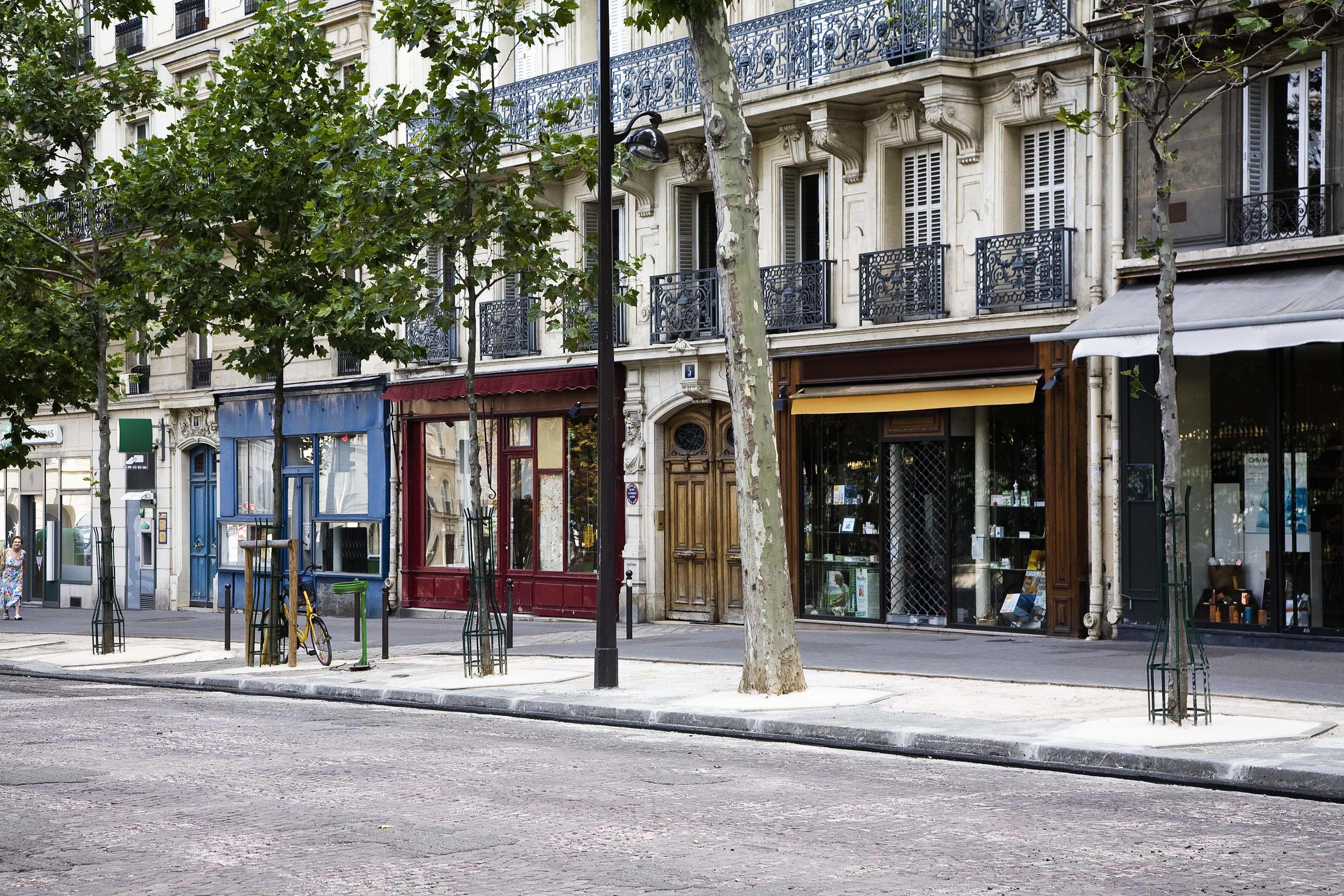
The capital of France is an iconic international city with widely recognisable visual elements and urban forms. Paris’ status has led many cities (including Melbourne and Sydney) to claim that they have a ‘Paris-end’ of town.
The Paris-End of cities can include visually iconic features, including types of balconies, doorways, street signs, or heritage buildings. But it’s also the underlying structure of cities – like how roads and buildings are arranged, or the amount of green space, or the types of public transport available.
Understanding urban forms
Urban typologies are a tool we use to categorise and compare cities and link their urban forms to the way people use them. These typologies are often defined using categories like ‘compact high-rise’, ‘residential low-rise’, or ‘light industrial’.

Using typologies is a means to account for local context and better target design that leads to improved health, transport and environmental outcomes.
Previous research at the Transport, Health and Urban Design Research Lab shows that the design of urban areas and transport systems can impact on public health outcomes, finding that compact city forms and the provision of public transport can result in significant health gains and reduced transport injuries.
Constructing typologies for this research required the collection of data across multiple political districts and reconciling inconsistencies and gaps - a daunting task at a global scale.
But, our newly published research using ‘big data’ and computer vision techniques now promises to make the job a little easier.
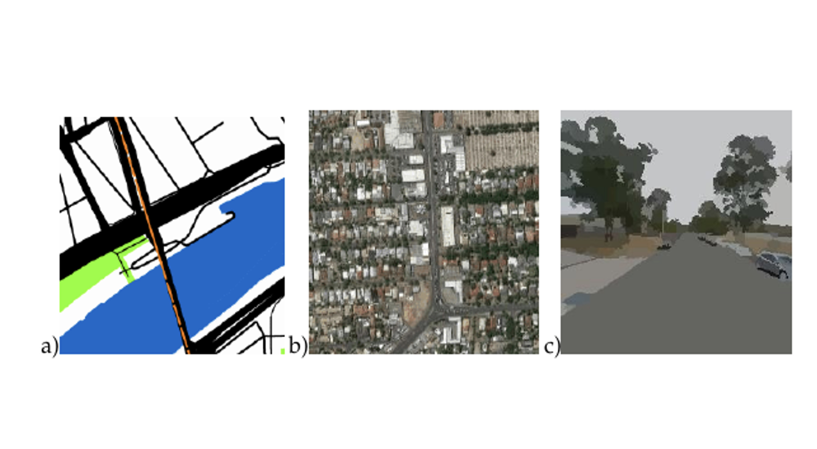
Our team used three different types of urban imagery to construct urban typologies for the largest 1,700 cities in the world, comparing the relative benefits and drawbacks of using each of these types of visual data. Along the way, we discovered that some major Australian cities are not as similar to Paris as we might like to think.
Training neural networks
The project is a continuation of research into clustering global cities using maps to identify key design types that contribute to road injuries and to generate measures of block size and regularity to identify neighbourhood types in global cities.
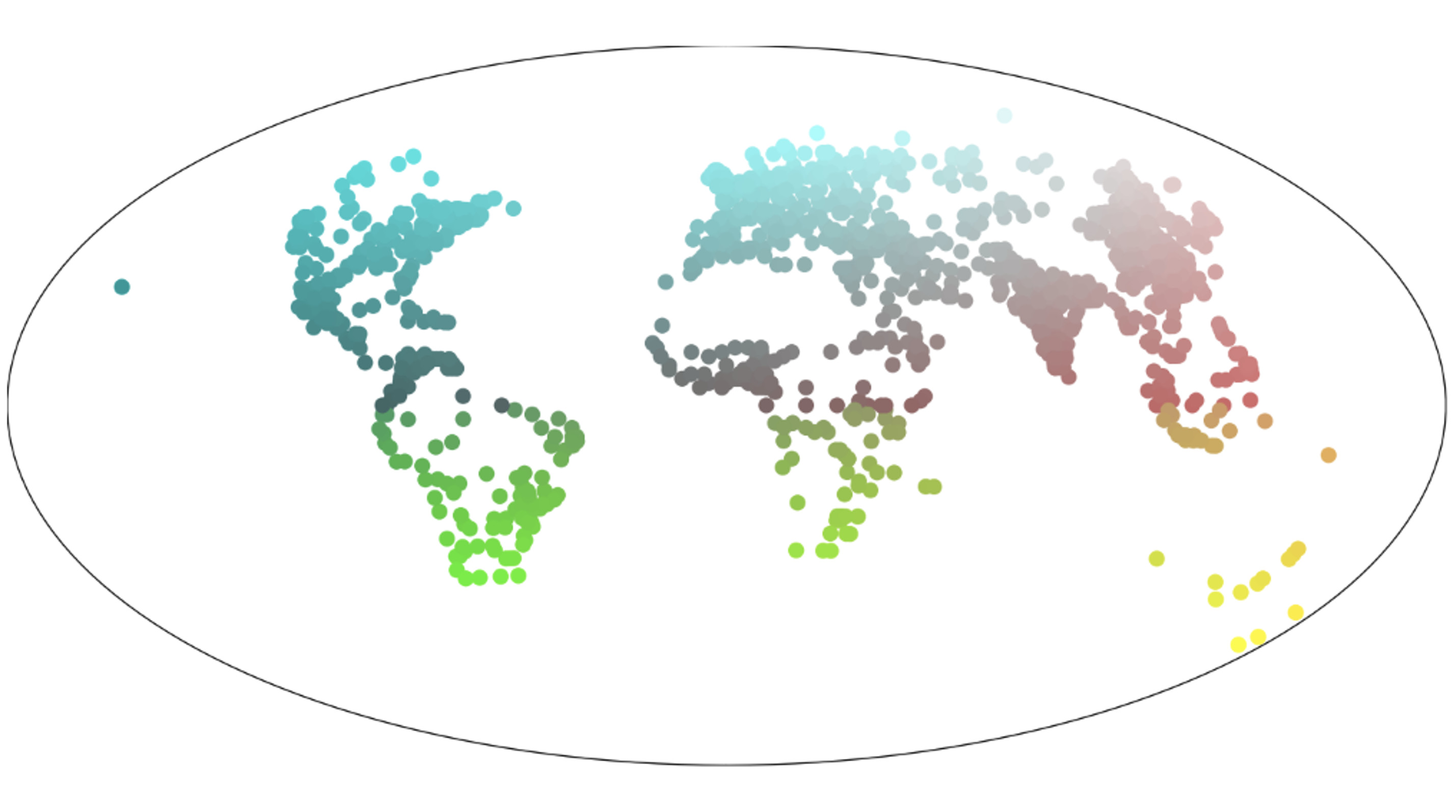
This time though, we expanded our image types from maps to also include satellite and street view imagery. The team then trained neural networks – a set of algorithms modelled loosely after the human brain - to recognise cities using these three types of imagery – maps, satellite and street-view imagery.
Melbourne or Sydney weren’t included in the neural network training – so when we presented the networks with images of Sydney or Melbourne, they had to work out which other global cities most resembled our two largest cities.
We plotted the predictions using a geographic colour scheme, and when Paris is predicted, it is highlighted with a star. Each type of imagery emphasised very different aspects of the cities, but unfortunately for Francophiles, less than 1 per cent of locations were predicted to be similar to Paris.

Politics & Society
Where to now for Australian property?
Most locations in Melbourne and Sydney deemed to be Paris-like were from map images a where the urban structure - streets, block dimensions and mix of green/blue space and types of public transport are similar to Paris.
Comparing global cities
So, while there may not actually be many Paris-like locations in Melbourne or Sydney, these predictions can still tell us other things about how to compare cities across the world, and how they vary according to the three different types of imagery.
Using the abstract map imagery, which emphasises the urban road and block structure, Melbourne and Sydney look most like other Australian cities (plotted in yellow).
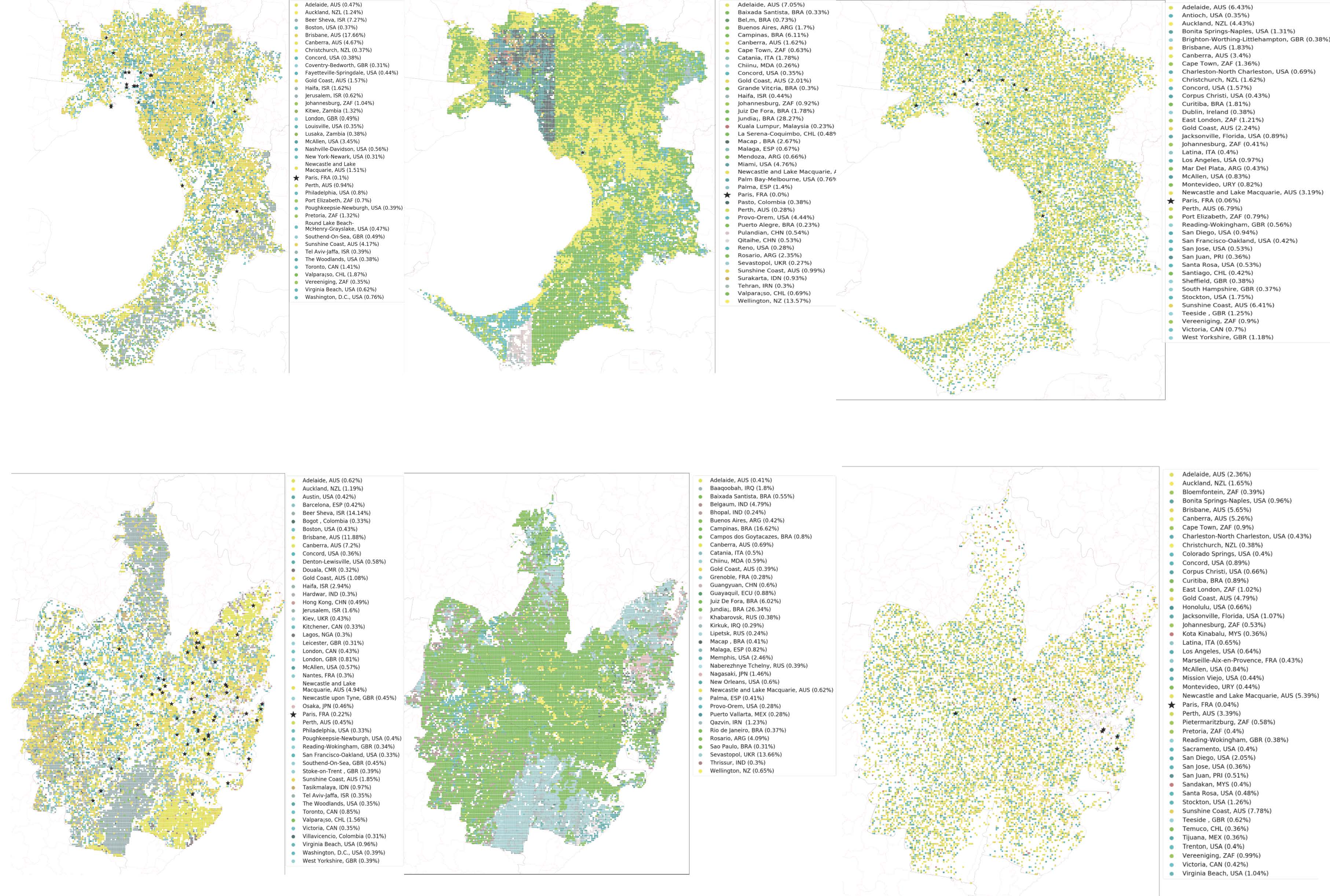
Using satellite imagery, the natural features and topography of Melbourne and Sydney are most often confused with cities in Brazil (plotted in shades of green), as well as a large pocket of Ukraine and Russia (blue/greys) in southern Sydney.
With street view imagery, it’s mostly other Australian cities that are confused for Melbourne and Sydney. At street level, the detail of how cities are used, street furniture, traffic and decorative elements on buildings are all details picked up as significant by the neural networks.
If we reverse the method and look at what other cities in the world were incorrectly predicted to be Paris, we find similar patterns.

At a street level, the cities most misidentified as Paris were other French cities: Toulouse, Lyon, Rouen, Saint-Etienne, Strasbourg, Bordeaux, Lille, Montpellier, Douai-Lens, Grenoble, Nantes, Valenciennes, Tours, and Toulon.
Not surprisingly, this tells us that, French cities look alike at least at a street level.
However, when using map imagery where urban transport structures are the most significant detail, Paris was less confused for other French cities and more commonly mistaken for other large cities in Western European and the Americas including London, Berlin, New York, Rome, Los Angeles, Tokyo, Zurich, Istanbul, Brasília and Munich.
When using satellite imagery, Paris was mostly mistaken for New York, Vancouver, Karlsruhe, Brisbane, Colorado Springs, Genova, Lisbon and Montpellier.
Identifying similarities and differences
While finding Paris in Australian cities might seem like a diversion, there is a serious purpose behind this work.
By finding similarities and differences between cities, we can take into account the local context when applying successful urban interventions from other cities. Interventions that might improve transport and mobility, levels of physical activity, air quality, perceived safety, or any number of other factors related to urban design.

Environment
Building equity into architecture
These same methods will form the backbone of our next project ‘A vision of healthy urban design for NCD prevention’ that seeks to investigate the contribution of city form to non-communicable diseases (NCD) such as cancer, heart disease, and respiratory conditions.
The aim is to develop a toolkit for urban planners, public health practitioners, and citizens to guide changes to cities to best promote public health.
By developing methods to look for the Paris-end of town in Australian cities, we can now plan and design better, healthier cities for everyone.
Banner: Getty Images


